Guide to Product Labels!
Looking at the products of famous skincare brands today, you will notice that their labels appear simple. By that, they incorporate only texts, a limited colour palette (mostly black and white), and fewer to no graphics – contrary to the typical labels you see with vibrant colours and multiple features to stand out.
If you are looking for label design ideas to brand or rebrand your skincare products, diving into the minimalism trend is worth considering.
Read on to have a good understanding of why a clean and clear label works for skincare businesses. And how you can apply this principle to your branding.
Table of Contents
What makes minimalist labelling popular in the skincare industry?
Clarity

Consumers are constantly bombarded with information and options. To make them notice your product on the shelves, you need to provide what other brands failed to offer: convenience when choosing.
You can achieve this by having a skincare label with a straightforward design to convey essential information very clearly. Doing this is particularly important for skincare products because buyers like it when they can quickly and easily understand what your product is for, what ingredients it contains, and how to use it.
Transparency through Product Label

Consumers are now becoming more and more conscious of the products they apply to their skin. A minimalistic design can effectively emphasize information customers would inspect first, like the ingredients list. Being transparent about what makes up your product gives people the confidence to buy.
Evoke Feelings of Purity

People buy skincare products to nourish their skin and maintain a healthy glow. And these days, consumers are leaning toward products made of natural and organic ingredients. A minimalist label design can bring a sense of purity to the branding and convey an impression of a clean, chemical-free product.
With that, it is safe to say that your packaging is just as important as the product itself to create a strong brand identity.
Principles of Minimalist Design Used in Skin Care Product Label
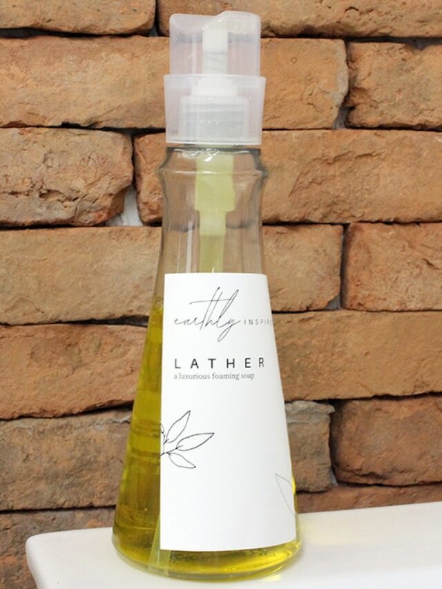
Clean Typography

Clean typography typically refers to sans-serif typefaces like Helvetica, Futura, and Open Sans. The lettering has a simple look making information highly readable, resulting in a clear and simple label.
Consistency is crucial to achieving a minimalist design. It is best to select a typeface that has several variations. This will help ensure a uniform look across the label. Use a combination of font weights, styles, and sizes to differentiate information.
Design Hierarchy

Design hierarchy refers to how design elements get arranged to create a sense of visual order and importance. It is essential in designing a skincare label to guide the customer’s eye to the most important information. And to create a sense of balance and harmony in the overall design.
In a minimalist design, typography is used to create a hierarchy. For example, the product name is displayed in larger font size and bold weight. The ingredients list can be in a smaller font size.
The use of colour is also effective in having a hierarchy in the design by using a bold, bright colour for the product name and a soft and muted colour for the supporting details.
White Space on Product Labels

The very essence of a minimalist design is to create an uncluttered look to the label by avoiding unnecessary detail. White space is the area between the design elements. It is a critical feature of this design approach to achieve balance and simplicity in the overall label design. Also, to guide the customers from one element to another.
However, white space does not necessarily mean using only white backgrounds. You can use any colour, texture, or pattern. The purpose is to avoid cramping the elements in the skincare label design.
In summary, the core value of a minimalist design is “less is more.” Remember to keep it simple and focus only on the most important details.
At StickerMarket, we can help you transform your attractive label designs into premium quality label stickers. We offer a wide range of sticker materials for you to choose from – from paper stickers to waterproof vinyl stickers.